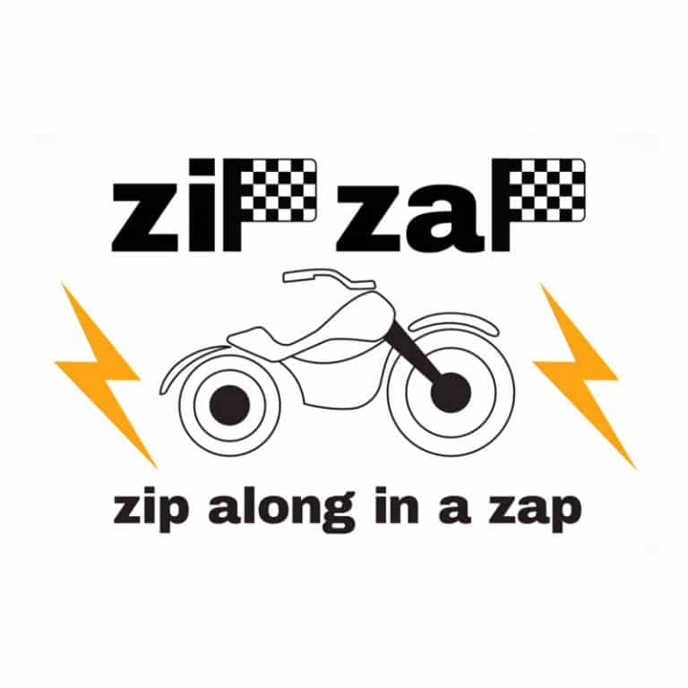
The Zip Zap logo, Zip Along in a Zap & the Solider logo Ride Dirty Drive cleans logos, are the worst logos the apprentice has ever seen, so where did they go wrong?

As a branding and design agency, we all looked forward to BBC’s The Apprentice this week as the candidates were handed a branding design and advertising task. During the task, both teams were given a ‘blank canvas’ of an electric motorbike to create a name, a company logo, a tagline and a colour palette in whatever style they saw fit and would then be tasked with advertising the bike.
As you may guess, the task didn’t go to plan for The Apprentice candidates as both teams came under fire from Lord Sugar for not giving out the right message in their advertising campaigns and not focusing properly on the subject or who it was aimed for.
As a branding agency, we know how important it is to get the basics right and start with a name that appeals to the target market. It is important to create names that resonate with the company, the brand and their audience. Creative and catchy brand names always stick and feed the imagination of consumers. Brand names need to stand out from the crowd but unfortunately, the names Soldier and Zip Zap were considered boring in the boardroom.
Let’s take a look at each logo in more detail.
The format of the programme doesn’t allow you to see the whole process within meetings due to the show condensing everything down to 1 hour, but we can build a picture of what happened.
What we can say is the choice of ‘Zip Zap logo, Zip Along in a Zap’ was a complete change of direction to the project manager’s instruction. Did the project manager, a petrolhead, a motorbike enthusiast, and someone who understood the Café Racer Culture fail to explain what this was? His initial logo Caf-E Racer was, for the purpose of the task, right ‘on the money’ and should have been a sure-fire winner. However, the sub-teams understanding of the logo, and what a Café Racer is was either not explained or just completely disregarded by the team. Zip Zap, or to call it by its proper name Zif Zaf, was the start of a string of fundamental mistakes that led to the failure of the task.
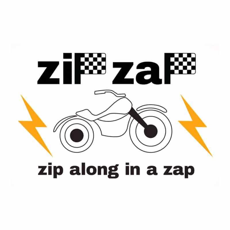
The design by the Sub Team manager clearly fell into the school of thought “my logo needs to encompass absolutely everything, the brand’s logo, tagline, what it does and how it does it”.
The winning brand was ‘Soldier, Ride Dirty Drive Clean’. A brand logo, positioning statement, TikTok ad and video so bad it could only be beaten by the Zip Zap logo. With every word and phrase, it is almost like they’ve never seen an advert or understood modern culture. With all the connotations of ‘Soldier’, war, fighting, aggression, discipline almost everything you don’t want your brand to represent. The positional statement was ‘Ride Dirty, Drive Clean’. It seemed to be saying “Ride a motorbike and you’ll get Dirty, drive a car, and keep Clean.” That’s without mentioning the Drive Clean that was pointed out in the presentation. You don’t drive a bike, you ride it, something the team failed to grasp.
The candidates didn’t fare any better when it came to creating video and Tik Tok adverts for the electric motorbikes. We know how difficult the task was, especially in trying to create something from scratch for what is a relatively new product to the market, but neither team seemed to grasp one of the fundamental rules of brand design, and that is establishing a brand purpose to create an emotional connection between the product and the customer. This couldn’t have been reinforced more by the fact the Zip Zap sub-team & team, booked an actor who couldn’t ride a motorbike so in the video, it had to be wheeled into the café as if it needed fixing. The advert for soldier only just manages to get a shot of the bike once one of the team said, ‘Shouldn’t we get some footage of the motorbike?’
Everyone is aware of the climate crisis we are currently facing and products like the electric motorbike have been created to ease environmental worries people have when using petrol or diesel vehicles. However, neither team opted to go down this route and instead created quite cliched ads which one industry professional described as looking like an ad for a dating app. Both teams focussed on sex appeal and pulling power rather than the appeal of the features and horsepower bike.
They may not be creative professionals but as we move away from consuming TV, Radio and Press advertisements our passive education of marketing will diminish. This can be clearly seen in the previous task where the candidates couldn’t use a street map. Harley Davidson’s brand position and reputation were built slowly and earned over a period of time, and the process can take years, but a brand name lacking in vision, attention to detail, and creativity can be severely detrimental to a company’s image in front of potential consumers
We never like to unduly criticise the candidates on The Apprentice. After all, most of them are not creative professionals and they never really have the time to put these tasks together properly. We all know brand position and reputation are built slowly and earned over a period of time, and the process can take years, but a brand name lacking in vision, attention to detail, and creativity can be severely detrimental to a company’s image in front of potential consumers.
In reality, BBC’s The Apprentice is just a TV show, and results like this keep us all glued to Lord Sugar’s boardroom. But it just goes to show that tasks like this in the hands of a team that doesn’t have the creative experience LemonTop have and don’t understand what is involved in creating a brand aimed at a specific type of customer, can result in some shocking yet highly entertaining outcomes.
Watching The Apprentice remains a genuine rollercoaster of emotions, especially when we see people struggling through a branding and design task like this. Brand design is one of our most sought-after services and branding is an inescapable part of everybody’s day-to-day life, yet it requires experience, knowledge and skilled design to get it right, and that’s where LemonTop excels.
We are big fans of The Apprentice and this episode with the Soldier & Zip Zap Logos, the worst logos ever on The Apprentice. can be seen on the BBC iPlayer
