burger restaurant Brand Craft Burger
showcasing: brand development • creative design • illustration • typography

The Challenge
Craft Burger are a brand new burger restaurant on Middlesbrough’s famous Linthorpe Road. In a strong market, awash with bold logotypes or family businesses whose brands are synonymous with the area and that had been around for generations the start-up wanted an identity that was bright and bold that would grab the attention. They had a colour palette in mind from the outset and knew what they liked (and didn’t) about the brand identities of the big players in the UK burger restaurant market. They were, however, happy to be guided by our brand design expertise.
The Solution
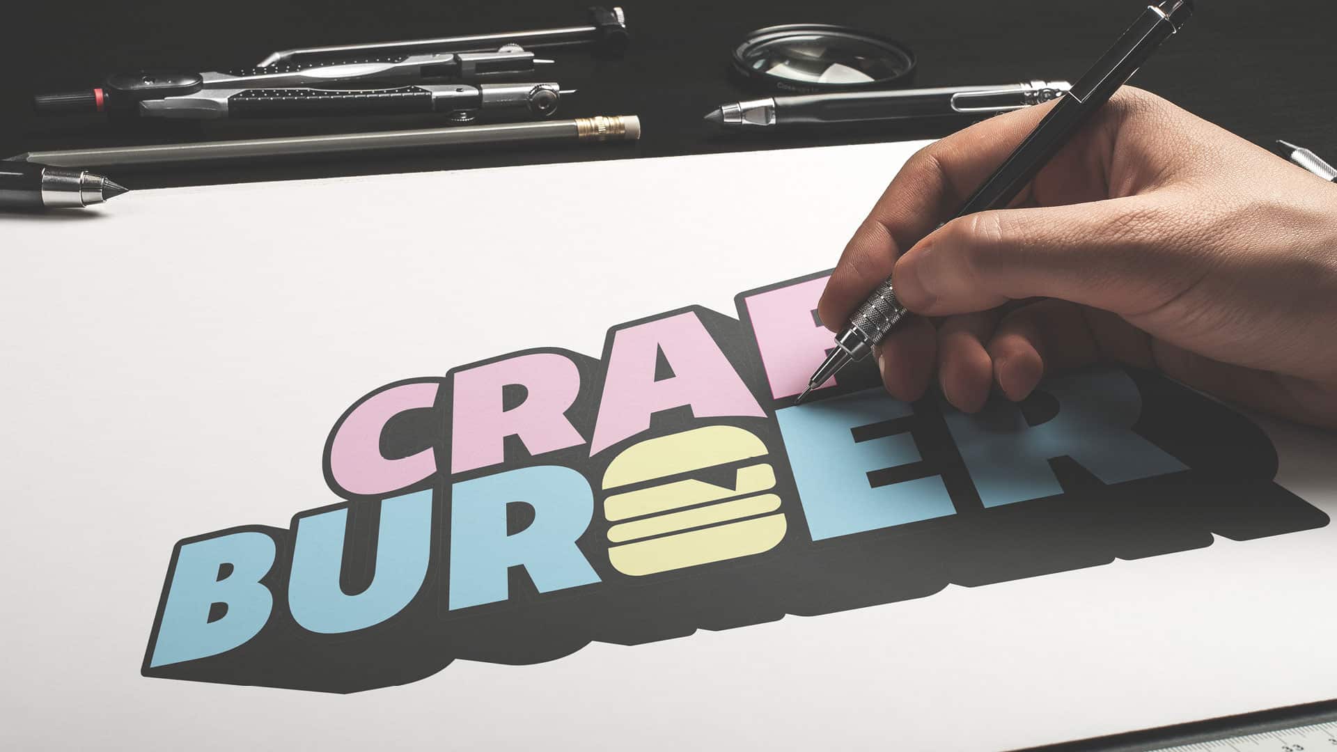
In their original brief the Craft Burger team had been inspired by both bold and flat designs and by pseudo-3d designs, so we took our cues from those and produced a varied range of ideations that covered a lot of bases. The end result is a pseudo-3D design utilising.

Considerations
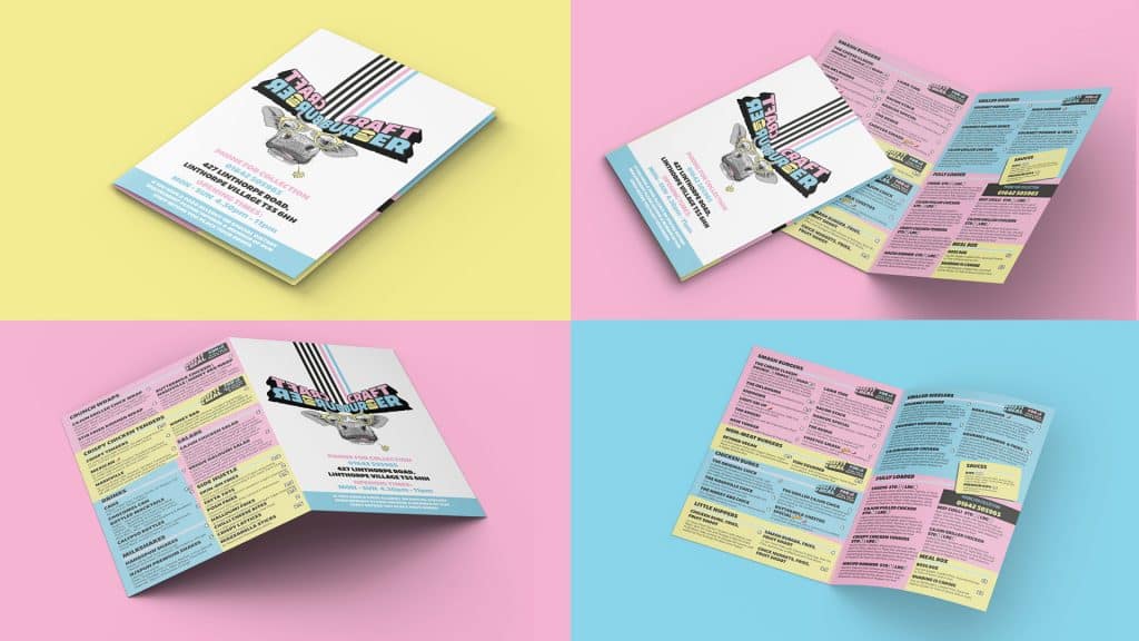
As with any brand design project lots of research was undertaken in order for us to come up with a strong identity for Craft Burger. It has to look the part, be intelligently designed and really stand out. Not just for the logo-marks and devices, but for the menu, too, as that carries on with the strong brand identity.
The results
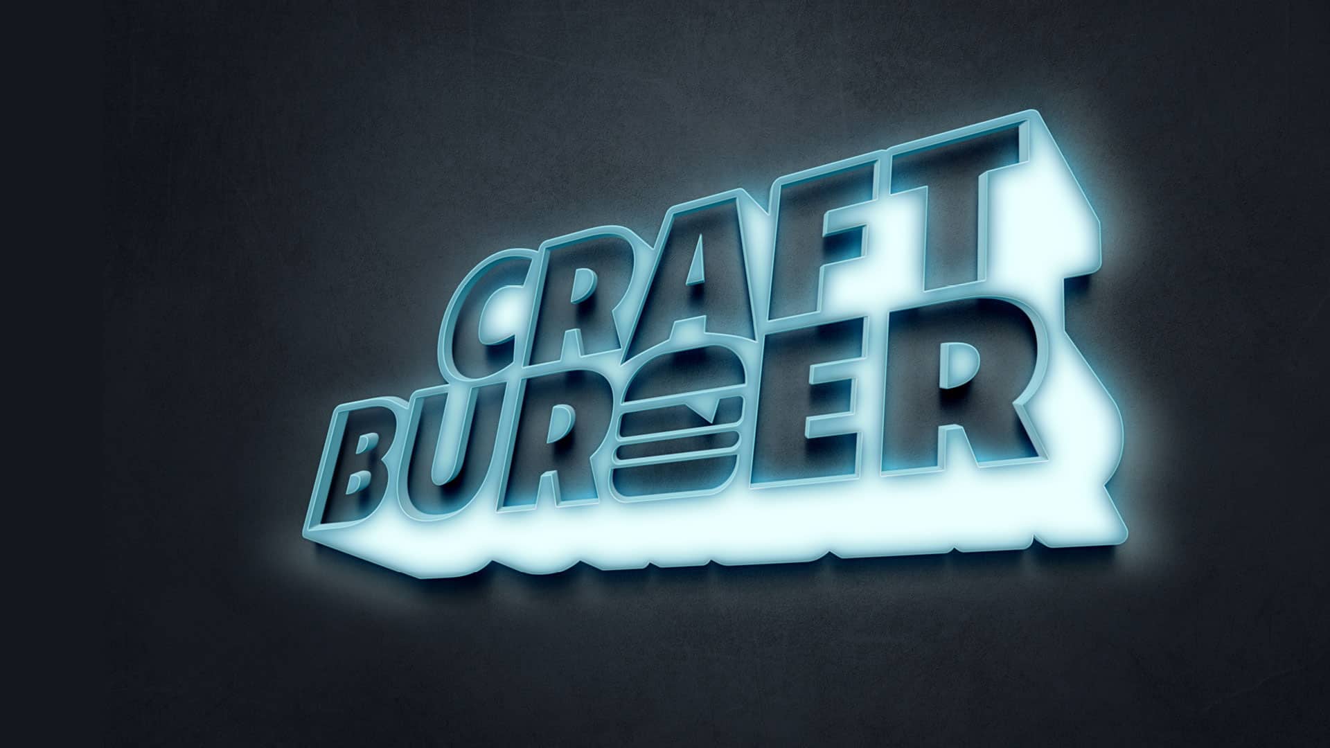
We came up with a bold pseudo-3D design that is just as strong in its regular state as it is in the various single-colour iterations. There is a strong Burger device embedded into the logo designed in as such a way as it affects a “G”, but is elevated further by the use of the third tint from the primary palette. This identity transfers happily over to the restaurant’s menu which uses the colour palette to differentiate between the various food and drinks on offer.